
Finished Murals
- Paul Krikau

- Jun 26, 2025
- 3 min read
I finished the murals nearly a month ago. I haven't made a final blog post about them because, well, life has been too busy to work on this blog. However, that is going to change. I have a list of blog topics that I will be writing and releasing on a bi-weekly basis. The plan is to write a bunch in advance and then post on a schedule.
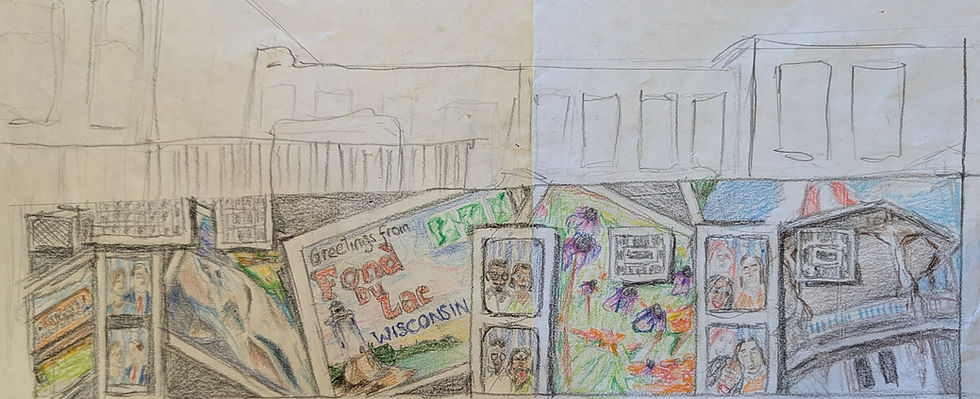
I did two murals on two different walls that had completely different surfaces to work on. The larger mural, technically, is covering the rear walls of two different adjoining buildings.

The idea for this mural was to utilize the different surfaces and the somewhat disjointed placement of doors and windows, creating a cohesive piece that hangs together. The windows, to my mind, resembled old projector slides from the 70s. So, I framed everything in white to make it look like a photo print. The doors were designed to look like photo booth strip prints. I looked up old strips online to see how far back I could go with the concept. I used the 50s and 60s, the 80s and 90s, and the new millennium as reference points.


The other components included representations of popular places and activities in the City of Fond du Lac, which include biking, fishing, the lighthouse, the gazebo, and the arboretum.


The other mural depicts Fond du Lac's Main Street in the 1960s, with some artistic liberties taken. The surface (cement board) was much easier to paint on as it was relatively flat, although rough. The largest challenge with this piece was the forced perspective. The racing flag in the foreground is meant to be interactive, so observers can pretend to hold the flag for the race in photos.

I occasionally use GIMP, a freeware similar to Adobe Photoshop, to work out compositions based on several inspiration pieces. I was able to position free 3D models of 1960s muscle cars on an archival photo of Fond du Lac to create my reference photo. Additionally, I used Inkscape, which is freeware similar to Adobe Illustrator, to make a line drawing over the reference photo. This let me put the artistic focus where I wanted it and simplified the background for me somewhat. I then chalked the line drawing onto the wall using a digital projector at night for guidance.

Things I learned about doing exterior murals from this project.
Knee pads are desirable and will be purchased before doing this again.
I should be doing squats regularly to be physically fit enough to do the work.
Although I cannot stand the song, Baz Luhrmann was correct about the sunscreen.
There are brushes made by Zibra specifically designed for rough surfaces, including exterior murals. I will be buying these with the knee pads before muraling again.
Mural income is reported as a "service" and not as a "good" when doing my taxes. That might be critical, and it might not be, but it was interesting to learn.
Lastly, simpler designs ARE better. While I am proud of the work I did AND I am not bummed that I did intense detail work, the designs could have been simpler. For example, Mindy's deer is highly detailed, but the background is the night sky with stars. They look great, but didn't take her days to do. This is the trick I will need to master to do murals efficiently.
My next topic is experimenting with stuff you have lying around your house to make art. Until then, what is an artistic endeavor you took on that taught you more than you expected? Let me know if the comments!

Comments